Bearing Prognostics on a Public Run-to-Failure Dataset
- 1,802 snapshots
- 4.6 million samples per channel
- 0 models trained
- 2 channels, 2 different answers
Overview
The two case studies either side of this one were built on plant I am responsible for, where the constraint is that no new sensors are coming. This one is the opposite exercise: a public dataset, laboratory conditions, a bearing deliberately run until it destroyed itself, and both accelerometers recorded throughout.
I wanted to answer a question the field data cannot answer, because the field data contains no confirmed bearing failure: when a bearing dies, which measurement tells you first?
The literature has a confident answer. Impact-type faults deposit their energy as brief taps that excite a structural resonance, so the impulsiveness measures — kurtosis, envelope kurtosis — are supposed to move months before the amplitude measures. Overall RMS is supposed to be the last thing to notice, by which point you are counting days. Every P-F curve in every vendor deck orders the techniques that way.
What this is
A one-pass feature extraction over Bearing1_3 from the FEMTO/PRONOSTIA run-to-failure dataset — 1,802 snapshots recorded ten seconds apart across the bearing's entire five-hour life, each snapshot a 0.1-second burst of 2,560 samples per channel at 25.6 kHz. Roughly 4.6 million samples per channel, reduced to a table of standard condition indicators, then examined for which indicator departs from its own baseline first.
Pure numpy and pandas. Kurtosis and skew from raw moments, the envelope via an FFT-based analytic signal, no scipy and no new dependencies. Every raw file is read exactly once and the feature table persisted, so no later analysis ever touches the CSVs again.
What this is not
No model was trained and no remaining-useful-life is predicted. This is feature archaeology, not prognostics in the competition sense — the dataset exists because a PHM challenge asked entrants to predict RUL, and that is emphatically not what happened here.
No bearing geometry was used, so no ball-pass frequencies were computed and nothing here identifies which element failed. This is trending, not diagnosis. Those are different jobs and conflating them is how work orders get written against the wrong component.
What actually happened
The textbook ordering did not survive contact with the data — but that turned out to be the less interesting half of the result.
The more interesting half is that the answer depended on which accelerometer I looked at. The horizontal channel and the vertical channel were bolted to the same bearing housing, watching the same failure, ninety degrees apart. Run the identical analysis on each and they disagree about which feature warns first, by a margin large enough to change what you would build.
Had I run this on one channel — as one naturally does, since the horizontal is listed first — I would have produced a clean, confident, and entirely channel-dependent conclusion, with no indication anywhere in the output that a second answer existed.
The Findings tab has the numbers. The short version is that a result which survives only one arbitrary choice is not a result yet.
Findings
Four features were tracked on both channels: RMS, kurtosis, envelope kurtosis, and the share of spectral energy in the 4–8 kHz band — the resonance region where bearing impacts are expected to ring.
"Departure" is defined once and applied identically everywhere: smooth with a 51-snapshot rolling median, learn a baseline from the first 20% of life, and flag the first moment the smoothed feature sits more than six robust standard deviations outside it and stays there for five consecutive minutes. The definition is mine, it is arbitrary in its constants, and the What's validated tab explains how much of the result rests on it.
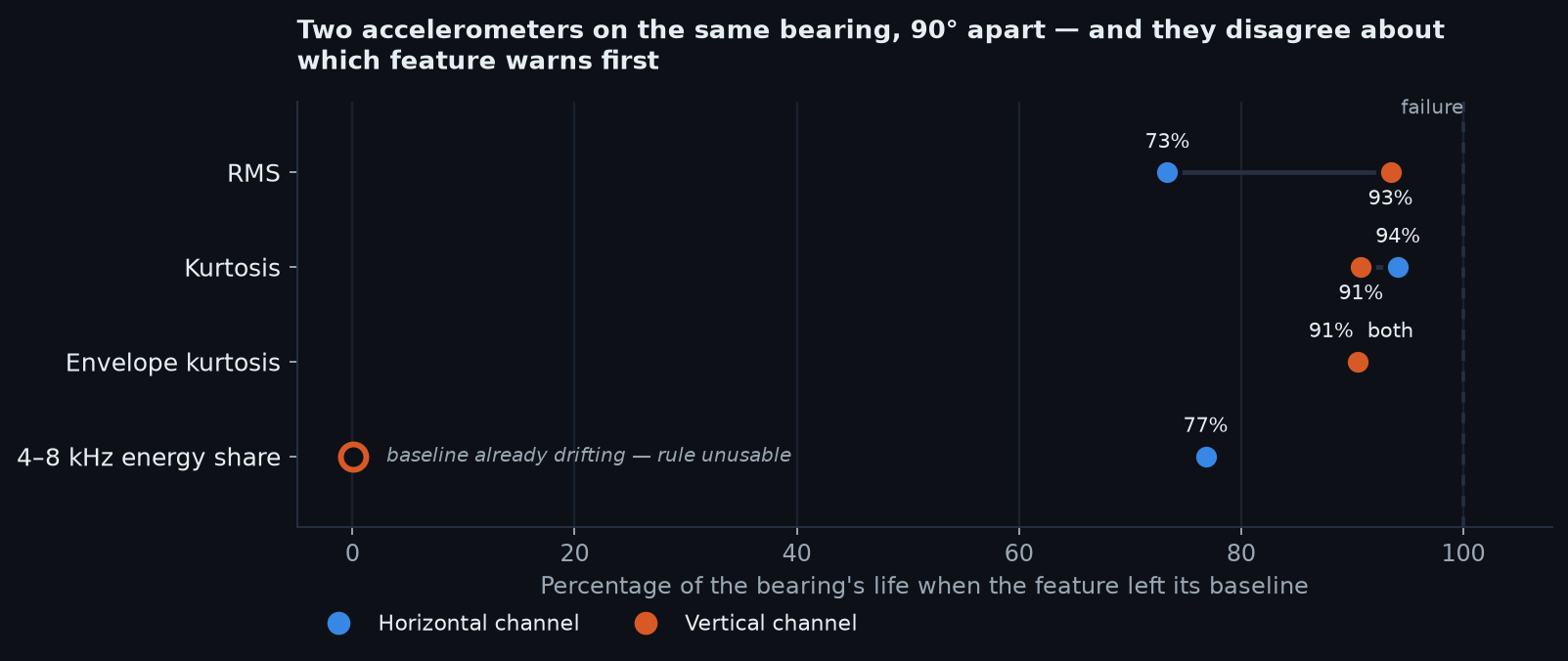
The textbook ordering is inverted — on one channel
On the horizontal channel, RMS departed at 73% of life. Kurtosis — the indicator that is supposed to give you months of warning — departed at 94%, some sixty-three minutes later, with the bearing already deep into its final hour.
That is precisely backwards. The measure billed as blind until the end arrived first, and the early-warning measure arrived nearly last.
On the vertical channel the textbook is broadly vindicated: envelope kurtosis and kurtosis both departed at 91%, and RMS at 93%. The impulsiveness measures led, as advertised.
Same bearing. Same failure. Same five hours. Same code.
The two channels see different failures
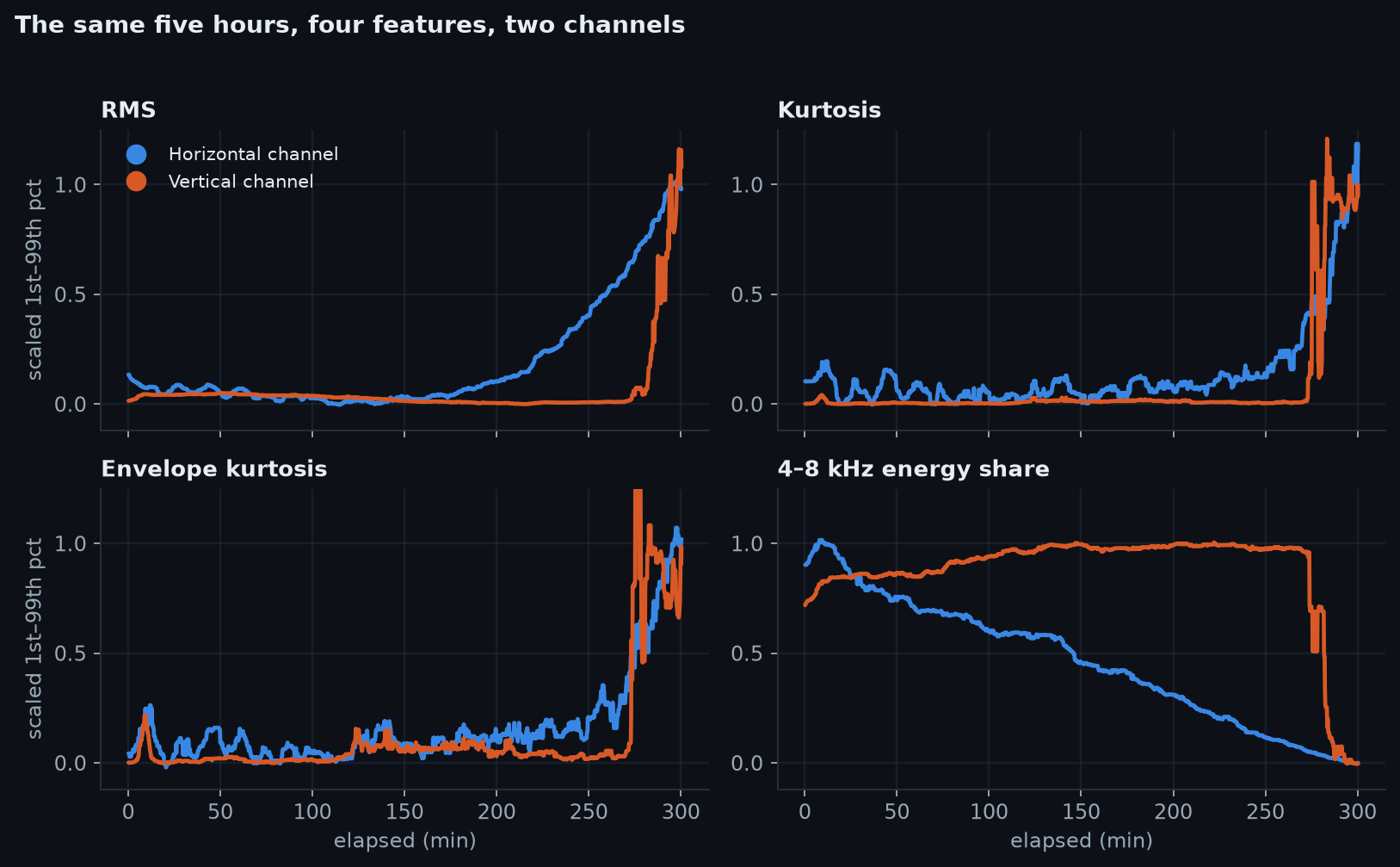
The shapes differ more than the timings do.
Horizontally the bearing degrades; vertically it falls off a cliff. Horizontal RMS climbs smoothly from around 200 minutes and roughly doubles over the run (×2.02). Vertical RMS does almost nothing for 275 minutes and then goes near-vertical, ending nearly seven times its starting value (×6.82). The vertical channel ultimately reacts far harder — it just gives almost no notice while doing it.
Which of those two you happened to instrument decides whether this failure looks like a degradation you could have scheduled around, or an event that arrived without warning.
The one feature carrying early information moves the wrong way
Through the first 200 minutes — while horizontal RMS was flat to within 3.6% — the horizontal 4–8 kHz energy share fell by 59%, from 0.243 to 0.099. It kept falling to 0.024 by failure, a 90% decline over the run.
It is the only feature carrying a clean, monotonic signal through the first two-thirds of the bearing's life, and every alarm anyone would normally build would have ignored it, because detectors are built to fire on things going up.
On the vertical channel the same feature rose by 36% over that period before collapsing in the final half-hour. Opposite directions, same housing, same window.
Counting spikes beats measuring them
Raw envelope kurtosis is close to unusable as a trend: it sits in the noise and throws occasional enormous values, up to 110 on the horizontal channel and 222 on the vertical, with no pattern a threshold can hold onto.
Counting them works. Taking the fraction of snapshots exceeding the 99th percentile of the baseline era, the spike rate rose from 0.009 to 0.099 on the horizontal channel and to 0.428 on the vertical — an eleven-fold and forty-seven-fold increase in a quantity that actually trends.
The information was in how often the bearing was shouting, not how loudly.
Lessons
- A result that depends on an undocumented choice is not a result. Nothing in the horizontal-channel output announced that the vertical channel disagreed.
- Sensor orientation is not a mounting detail — it is an experimental variable. Which axis faces the load zone changes the answer to "what should we monitor?"
- Detectors that only look for increases are half-blind. The strongest early signal here was a decline.
- A feature that trends beats a feature that spikes, even when the spiking one is the more physically meaningful of the two.
Technical
The data
FEMTO/PRONOSTIA, Bearing1_3. The dataset was produced on an accelerated-life test rig and released for the IEEE PHM 2012 prognostics challenge. Bearings are loaded well past service conditions and run until vibration exceeds a stop threshold, which is why an entire bearing life fits inside five hours.
Each snapshot is a 0.1-second burst: 2,560 samples per channel at 25.6 kHz, recorded every ten seconds, on two accelerometers — horizontal and vertical. For Bearing1_3 that is 1,802 snapshots, about 4.6 million samples per channel, spanning 300.3 minutes.
The embedded wall-clock stamps in the FEMTO files are not reliable enough to use as a time axis, so the axis is snapshot index × 10 s, and the file stamp is retained only as a reference column.
Extraction
One pass, by design. Every raw CSV is read exactly once, reduced to a row of features, and the
resulting table persisted as both .npz and .csv. No downstream analysis ever parses the raw
files again — which matters when the alternative is re-reading 1,802 files for every change of
mind.
Per snapshot, per channel:
| Group | Features |
|---|---|
| Amplitude | RMS, peak, peak-to-peak, standard deviation |
| Shape | crest factor, kurtosis, skew, impulse factor, clearance factor |
| Spectral | energy share in 0–500, 500–1500, 1500–4000, 4000–8000, 8000–12800 Hz; spectral centroid |
| Envelope | envelope RMS, envelope kurtosis |
Kurtosis and skew are computed from raw moments rather than a statistics library, and the envelope is the magnitude of the analytic signal obtained by zeroing the negative-frequency half of the FFT and doubling the positive half — a Hilbert transform without scipy. The whole thing runs on numpy and pandas alone.
Malformed rows are counted and reported, never silently patched. A quietly repaired input is indistinguishable from a clean one by the time it reaches a chart.
Why enveloping is in here at all
A spalled outer race is struck once per ball pass. Each strike is brief and weak — too small to move the machine, but enough to excite the housing's own resonance, which rings and dies. The energy therefore lands smeared around that resonance in the kilohertz region, while the information — which element is damaged — is carried in the repetition rate of the bursts.
A raw FFT files by energy and misses the rhythm. Band-passing around the resonance, rectifying and smoothing recovers the burst outline, and transforming that puts a peak at the fault frequency. It is amplitude demodulation, the same operation as tuning an AM radio: the resonance is the carrier, the fault rhythm is the broadcast.
The 4–8 kHz band was tracked because it is a plausible carrier region for this rig. Which brings a caveat that materially affects the Findings:
The band features are shares of total spectral energy, not absolute energy. Each is that band's sum divided by the whole spectrum's. So when low-frequency energy grows, the high-frequency share falls even if its absolute content is unchanged.
That confound is real for the final third of the run, where RMS is climbing hard. It is not available as an explanation for the first 200 minutes, because horizontal RMS moved by −3.6% across that window — the denominator was flat while the share fell 59%. The early decline is a genuine redistribution of spectral content. The late decline is partly arithmetic.
The departure rule
smooth      51-snapshot centred rolling median  (8.5 min)
baseline    median of the first 20% of life
scale       1.4826 × MAD of that same window
trigger     |value − baseline| > 6 × scale
hold        sustained for 30 consecutive snapshots (5 min)
Robust statistics throughout, because the raw features contain exactly the kind of isolated enormous values that would wreck a mean-and-standard-deviation baseline — envelope kurtosis reaches 222 on the vertical channel against a baseline near 0.6.
The hold requirement is what separates a departure from a spike. Without it, envelope kurtosis "departs" within the first ten minutes on both channels and never means anything by it.
Where the rule breaks
On the vertical 4–8 kHz share, the rule returns a departure at 0% of life — and that number is not a finding, it is a failure of the method.
The baseline window is the first 20% of life. If a feature is already trending during that window, the baseline is computed from moving data, the scale estimate is inflated by the trend it contains, and "departure from baseline" stops meaning anything. That is exactly what the vertical band share does.
A baseline-departure detector cannot detect a process that was already underway when recording began. This is not a defect peculiar to my constants; it is structural to the entire family of learn-normal-then-alarm methods, and it is worth saying out loud because those methods are what most condition-monitoring products are. The honest output in that situation is "no usable baseline", which is what the chart says, rather than a percentage that would read as "warned immediately".
What's validated
What is solid
The extraction. Every number on this page traces to one pass over 1,802 raw files, with
malformed rows counted rather than patched. The feature table is reproducible from the raw data
by running one script, and the intermediate .npz is what every chart reads.
The disagreement between channels. This is the central claim and it is robust to the thing most likely to have caused it. The two channels were processed by identical code, with identical constants, in the same run. The horizontal/vertical divergence in RMS departure — 73% against 93% of life — is far larger than any plausible sensitivity to smoothing window or threshold.
The early decline in the horizontal 4–8 kHz share. Falling 59% while RMS moved 3.6% is not a normalisation artefact, because normalisation requires a moving denominator and there wasn't one.
What is one bearing's worth of evidence
Everything else. This is a single bearing, from a single operating condition, on an accelerated test rig.
FEMTO bearings are notoriously heterogeneous — that heterogeneity is much of why the challenge was hard — and I have not verified that anything here generalises to Bearing1_4, let alone to a different load condition or a real machine.
Accelerated life is not service life. Five hours of deliberate overload is not five years of duty, and there is no guarantee the degradation physics are the same ones a field bearing follows. A conclusion about warning time drawn from a rig that is trying to destroy the bearing should be held loosely.
So: the textbook ordering failed on this bearing, on this channel. That is a demonstration that the ordering is not universal. It is not evidence about how often it fails, and I have no basis for a rate.
What rests on my definition of "departure"
The 73%/94% figures are properties of the data and of a rule I wrote: 51-snapshot median, first-20% baseline, six robust sigma, five-minute hold. Four constants, none derived.
Change them and the numbers move. A shorter hold makes the noisy horizontal kurtosis trace depart earlier; a longer smoothing window delays everything; a different baseline fraction moves all four features at once.
What I checked is that the ordering on each channel is stable across reasonable settings, and that the h-versus-v gap survives them. What I did not do is a proper sensitivity sweep with the results published, which is what would be required to state the constants do not matter.
What is not claimed at all
- No remaining-useful-life prediction. Nothing here estimates time to failure.
- No fault classification. No bearing geometry, no ball-pass frequencies, no statement about which element failed. Trending only.
- No model. Nothing was trained, so nothing can be over-fitted — and equally, nothing here demonstrates modelling ability. It demonstrates the step that should precede modelling.
- No claim about vendor systems. A commercial analyser tracks far more than four features, and may well fuse channels in a way that dissolves the problem described here. I have not tested one.
The honest summary
One bearing died in a laboratory and I measured it two ways, carefully, and got two answers. The value of that is not the answers. It is that the disagreement was invisible from inside either one of them — and the same is true of most single-channel, single-configuration results, including ones with far more statistical machinery behind them than this.
A finding that has only been derived once has been assumed, not established.
Future work
The obvious next run
Every bearing in condition 1, same code, same constants. The extraction already runs unattended; pointing it at the remaining bearings costs an afternoon and converts "the textbook failed here" into a rate. If the channel disagreement recurs across bearings, it is a property of the measurement rather than of this bearing, and that is a much stronger claim.
A published sensitivity sweep. Vary the four constants over a grid, report how the departure ordering moves, and show whether the h-versus-v gap survives all of it. This is the difference between believing the result is robust and having demonstrated it.
Fault frequencies. The bearing geometry is documented; computing ball-pass frequencies and looking for them in the envelope spectrum would turn trending into diagnosis, and would test whether the 4–8 kHz band actually contains the carrier or was simply a plausible guess.
The thing worth building
A monitoring system that only alarms on features going up is missing the strongest early signal in this dataset. A detector that watches for sustained departure in either direction — with a defensible answer to "why did this fall?" — is a small change to the anomaly work in Part 1 and would have caught the 4–8 kHz decline at roughly the same point RMS was noticed.
The harder and more interesting version is a baseline that admits it does not have one. The failure documented in the Technical tab — a learn-normal detector cannot see a process that started before recording did — is silent, structural, and applies to essentially every condition-monitoring product on the market. A system that tested its own baseline window for trend, and refused to arm when the window was already drifting, would be more honest than one that quietly emits a confident threshold.
Where this connects
This sits deliberately next to the electrical work rather than apart from it. The fan drift study reached the same conclusion from the opposite direction: it set out to detect degradation and instead found that the instrumentation could not be trusted yet, and said so rather than reporting a number.
Both are the same lesson at different scales. The measurement chain is part of the measurement, and treating it as transparent is how a confident wrong answer gets produced.
What I am not going to do
Enter the RUL competition retrospectively. Predicting remaining life on a dataset whose answers are published, years after the fact, produces a number that cannot be honestly compared to anything. If I build a prognostic model it will be on data where I do not already know the ending.
Add machine learning to make this look more sophisticated. The finding here is a counterexample to a rule of thumb, established with arithmetic. Wrapping it in a classifier would obscure the one thing that makes it useful: every step is inspectable, and the surprising result can be traced back to the raw samples that produced it.
Direction
Everyone has a notebook on this dataset. The part of this study that is not commodity is what the human layer contributed once the computation was handled, so this tab documents that directly rather than leaving you to infer it.
The question was the first decision
I had a real one in front of me: an escalator monitoring pilot that needed a defensible answer to which measurement warns first, and I had no analysis capability of my own to settle it.
Choosing "when a bearing dies, which measurement tells you first?" over the obvious alternative — can I predict remaining useful life? — was the decision that shaped everything after it. The RUL question is what the dataset was published for, it is what a competition scored, and it is what I would have had no honest way to evaluate. The detection-order question I could reason about, argue with, and check.
A question you cannot audit the answer to is the wrong question to ask.
The standards were set before the results existed
Three requirements, stated up front, before any number came back:
Separate the tiers of evidence explicitly. What is validated, what is one bearing's worth of evidence, what is not claimed at all. That structure is why the What's validated tab exists and why it is longer than the findings.
No retrofitted prediction model. The published answers exist; predicting them afterwards produces a number that cannot honestly be compared to anything.
No machine learning for sophistication's sake. A counterexample established with arithmetic is worth more than the same counterexample wrapped in a classifier, because every step stays inspectable back to the raw samples.
Refusals are the cheapest quality control available and they have to happen before you see the output, or they stop being refusals and start being edits.
The instruction that produced the finding
The analysis was run on the horizontal channel first, because it is listed first. The result was clean, publishable, and would have gone out as a confident claim that the textbook detection ordering is inverted.
Run it again on the vertical channel was the direction that mattered. It cost one line of configuration and it destroyed the original conclusion — the two channels disagree, and the textbook holds on one and inverts on the other.
That is the entire value of the study, and it came from a habit rather than from expertise: before believing a result, change one arbitrary choice you did not know you were making and see if it survives.
Three things the machine got wrong, and how they were caught
The story it reached for was not the story in the data. The obvious write-up here is the textbook stage-4 reversal — kurtosis rising then falling back as spall edges smooth over. It is well documented, it is what I had read, and it is not what these traces show. Written from the textbook rather than from the plots, it would have been fluent, plausible and false. Catching it required looking at the actual charts and refusing the narrative that was already half-written.
A ratio was nearly reported as a quantity. The 4–8 kHz band feature is a share of total spectral energy, not absolute energy. As low-frequency energy grows, that share falls whether or not anything changed up high. Reading the extraction code rather than trusting the feature name is what separated the part of the decline that is real from the part that is arithmetic — and the honest claim now covers only the first 200 minutes, where the denominator was flat.
A degenerate output nearly became a headline. The departure rule returned "0% of life" for one channel's band feature, which reads as warned immediately and means the exact opposite: the baseline window was already inside the trend, so the rule had nothing to measure against. The chart says "no usable baseline" instead of a number because a number there would have inverted the meaning.
None of those three required analyst-tier statistics. All three required someone who cared more about being right than about having a result.
What this actually demonstrates
Not that I can compute bearing features — the code is on this page and I did not write it.
That I can take a domain adjacent to mine, direct AI through real work in it, and hold the output to a standard it does not hold itself to. The machine has no idea when it is wrong. It produced a confident single-channel conclusion, reached for a textbook narrative the data did not support, and offered a degenerate result as a finding. Each of those is the kind of error that survives review precisely because it arrives well-written.
I did more here than I could have done alone, and less than the page would imply if it did not say so. Both halves of that sentence are the point.
The method note explains why I work this way, and the learning I did separately so that I could.